Sarah Shorrocks is an interior designer who runs a design practice in Weybridge, Surrey. Having always had a passion for design, Sarah and her husband acquired and renovated their Victorian house (which only had four walls and a shaky roof when they started!) and wanted to share their experience with others. After undertaking appropriate training and work experience, Sarah started her own interior design business. Outstanding Interiors has been running successfully for ten years designing kitchens and bathrooms as well as offering a full range of other design services for both domestic and commercial properties.
Sarah’s own home makeover features Original Style tiles in her hallway, kitchen and three bathrooms! So we asked her some questions about the project and how tiles can transform a home…
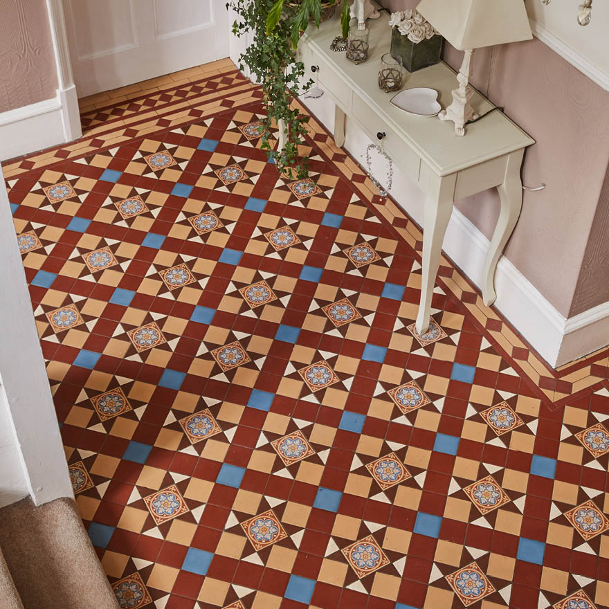
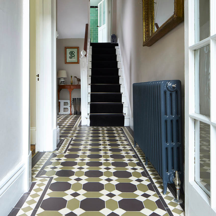
Q. Your home features so many beautifully tiled focal points! Let’s start with the hallway, what made you choose Victorian Floor Tiles? A.
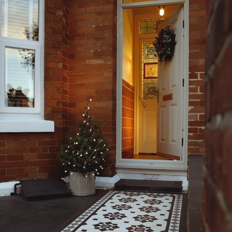
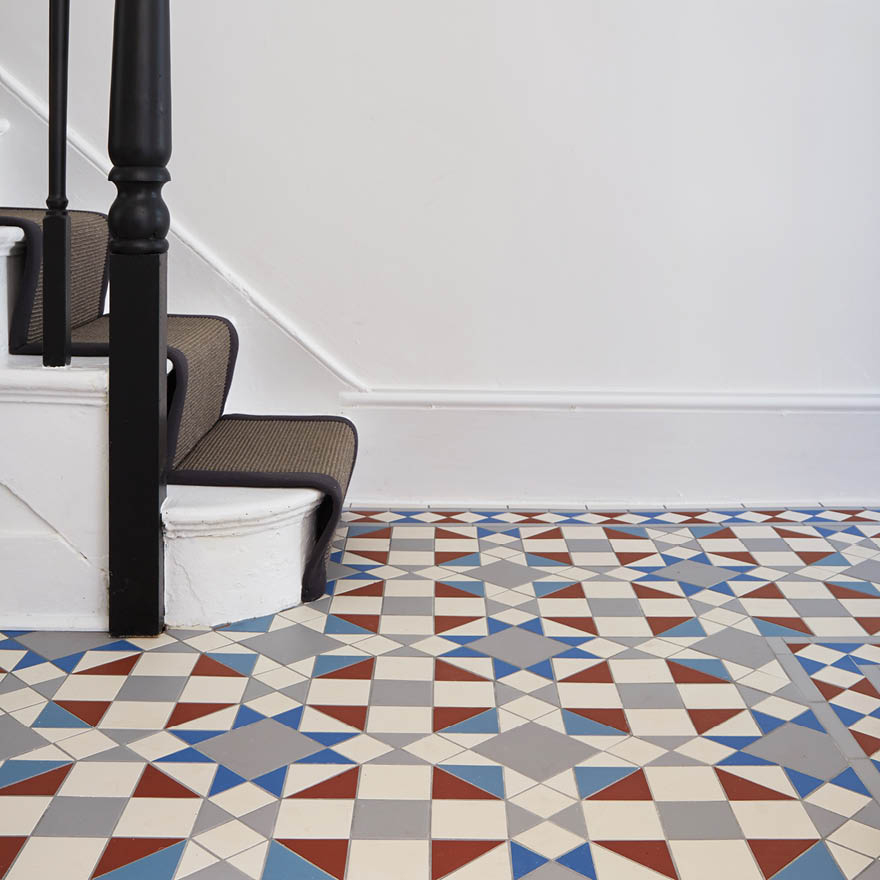
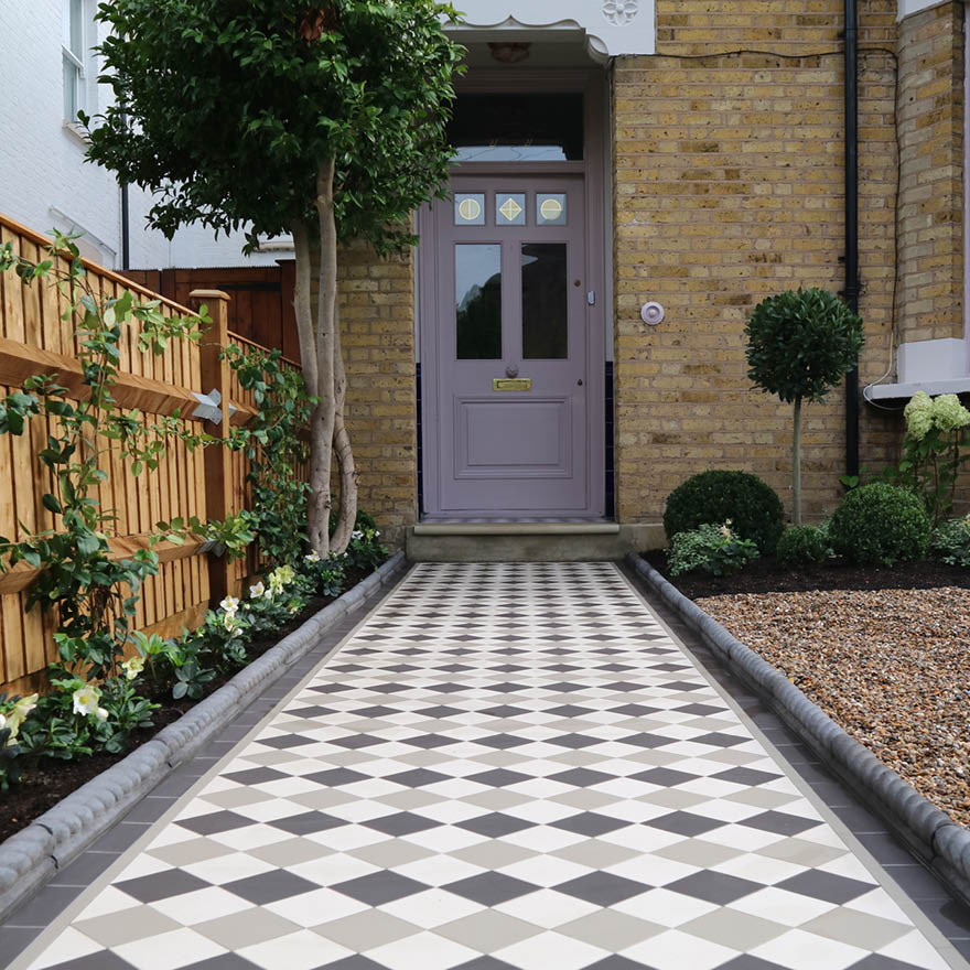
Victorian floor tiles were the perfect solution for this busy runway of a space. With the constant comings and goings of our three children, their friends, our visitors and our pets, they are practical, resilient and beautiful. They are also a perfect fit for any period home and create a stunning first impression.
Q. How important were the tiles and how did you source them? In the end, why did you go for Victorian Floor Tiles and what was it that you found appealing about them? A. The tiles were a vital style statement, setting the tone for this space was key in creating a real wow factor when you first enter our home. They were a real investment but were one of the first things we purchased when doing our renovation. They have provided a really durable flooring solution and given a lot of pleasure over the years. We sourced from Original Style in Exeter with whom we have a long-standing relationship. It would be difficult to find another source of tiles where there is such expertise and range. This is a company which really knows its stuff.

Q. We love the distinct styles in your bathrooms, how did go about designing these rooms? A. Each of the bathrooms is deliberately distinctive. As a design practice we have never shied away from colour. The
Royal Blue Acanthus and
Dentil moulding (from the
Artworks collection) in the guest bathroom act as a perfect foil for the blue bath on claw feet and sit well with the white field tile creating a sense of freshness in this space.
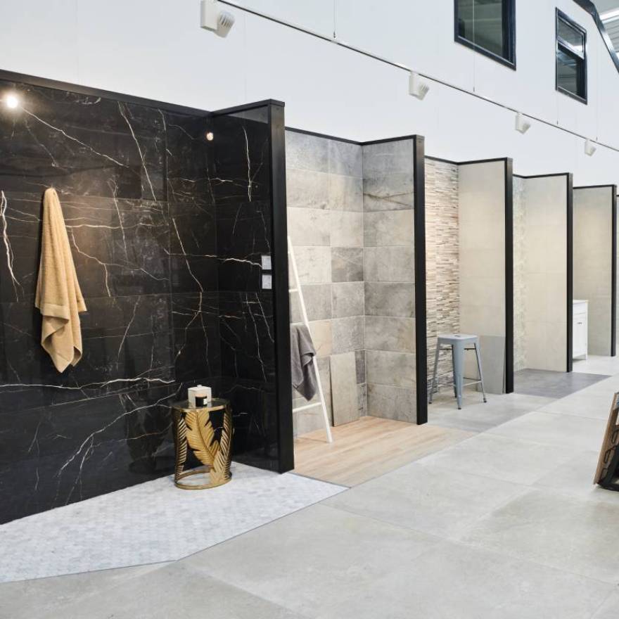
Q. What were the main goals you wanted to achieve in these rooms (were you looking for a specific style, colour ways, maximizing space)? A. At Outstanding Interiors, we see tiling as a way of anchoring a space, providing accent colour, texture or pattern to give interest and vibrancy to a scheme. Each tile we choose for a client will reflect their setting, their style and their budget and there is a huge range to choose from with Original Style Tiles from contemporary to traditional, glamorous to rustic.

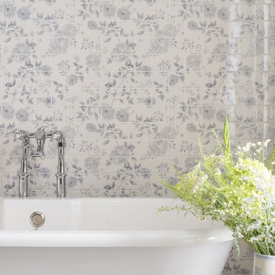
Q. Where did you get your inspiration for these rooms? A. When designing a room, we always look for and develop a design theme. The guest bathroom has a fun slightly nautical feel with its porthole shaped window, so a dark but vibrant blue was chosen; we also didn’t want to detract from the architecture of the room. The Arts and Crafts round window needed to remain a focus, so the Victorian style white gloss field tiles are a perfect choice for this airy space. We had a lovely vintage brass and crystal chandelier in our bedroom so the ensuite bathroom brassware needed to be consistent with this. The choice of Victorian Clematis Gloss field tiles and Jade accent tiles worked perfectly with the brassware. Our tiler at the time Mark also had a say in this scheme as the shells were his particular favourite!
In the family bathroom the Artworks
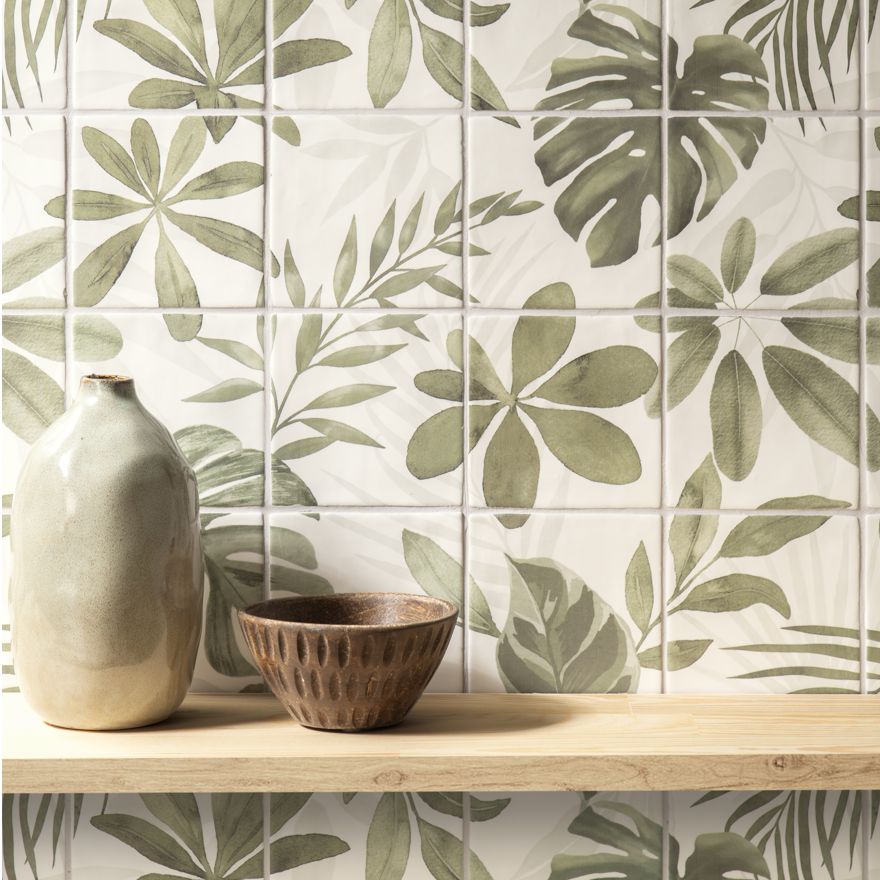
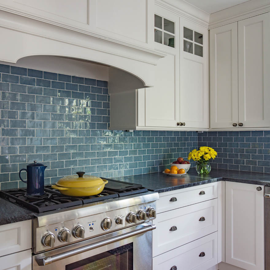
London Stone tiles provide a good contemporary, glamorous accent to an otherwise traditional design and act as a stunning backdrop to the vintage nickel shower fitting. The splashback behind the Rayburn works wonderfully with other accents in our large eat-in family kitchen. The green Winchester Arcadian
Danube handmade tiles look fabulous and chime in with the colour we selected for our island.

Q. Did anything go wrong/differently to how you expected? A. Careful planning meant that most things went as expected and this is key. However, in the very early days when moving a radiator we did find a wasps’ nest under the floorboards, but fortunately it was no longer occupied. When restoring the chimneys of the house early on, the builder found that there was no mortar between the bricks, so a high wind might have sent the chimney pots tumbling into the street. We were very pleased to have found this problem early on and remedied it.
Q. What do you like best about the rooms now? A. We love their enduring, timeless and functional nature and the lovely accents of design provided by our stunning tiles.
Q. What advice would you give to people looking to create fabulous tiled focal points in their homes? (e.g. opt for simplicity, be bold with colours, make sure you get high-quality tiles, embrace variety in shapes and sizes, etc) A. Always check out the Original Style range first, they have the widest choice and the most versatile selection. Plan your spaces carefully and don’t be tempted to put too many different designs in one room. Simplicity and a limited number of focal points are key.
